

Most homeowners glance at their solar app once or twice, see a green number, and assume everything is fine. But knowing how to read solar production monitoring data properly is what separates homeowners who get full value from their systems from those who silently lose hundreds of dollars to underperformance. Solar monitoring can feel technical and cluttered with unfamiliar metrics. This guide breaks down exactly what to look at, what the numbers mean, and how to spot problems before they cost you money.
Table of Contents
- Key takeaways
- Solar production monitoring data: what it is and what you need
- How to read and interpret key solar metrics
- Warning signs and troubleshooting your monitoring data
- Analyzing solar production trends over time
- My perspective on solar monitoring as a daily habit
- Get a professional review before problems compound
- FAQ
Key takeaways
| Point | Details |
|---|---|
| kW vs. kWh distinction matters | kW shows live power output; kWh tracks total energy produced and drives your savings calculations. |
| Bell curve shape signals health | A smooth bell-shaped production curve through the day indicates your system is performing normally. |
| 15-minute interval data is more accurate | High-resolution interval data is 10–25% more accurate than monthly totals for performance assessment. |
| Consumption data completes the picture | Production monitoring alone misses export and self-consumption patterns that directly affect your financial return. |
| Trends reveal degradation early | Comparing monthly and annual output against installer projections helps you catch panel degradation before it compounds. |
Solar production monitoring data: what it is and what you need
Solar production monitoring data is the continuous record of how much electricity your solar system generates. It comes from your inverter, which measures output in real time and logs it at regular intervals. Most residential systems record data in 15-minute intervals. To convert that interval data into energy units, the rule is straightforward: kWh equals kW multiplied by 0.25 for each 15-minute period.
Before you can analyze anything, you need consistent access to your data. Here is what to gather first:
- Monitoring app login credentials from your installer (SolarEdge, Enphase, Fronius, and similar brands all have dedicated portals)
- Inverter display access for real-time readings when the app is unavailable
- System specs sheet showing your installed capacity in kilowatts (kW) and expected annual output in kilowatt-hours (kWh)
- Utility account login to cross-reference export credits and net metering data
- Installer's production estimate so you have a baseline to compare against
Pro Tip: Before troubleshooting any data issue, verify your inverter is connected to Wi-Fi and your monitoring account is synced. Disconnected systems report zero output in the app even when the panels are working perfectly.
Data validation matters more than most homeowners realize. Raw interval data exports often contain missing intervals, duplicate entries, or time zone errors that distort your analysis. Interval data needs cleaning before it gives you accurate results. Most consumer apps handle this automatically, but if you ever export raw data to a spreadsheet, check for gaps and anomalies before drawing conclusions.
The table below shows the most common monitoring tools and what data each provides:
| Tool | Data available | Best use |
|---|---|---|
| Inverter display | Real-time kW, daily kWh, error codes | Quick checks, fault detection |
| Manufacturer app/portal | Interval history, graphs, alerts | Daily monitoring, trend review |
| Utility portal | Export credits, net metering totals | Financial reconciliation |
| Third-party platforms | Multi-system aggregation, custom reports | Advanced analysis |
How to read and interpret key solar metrics
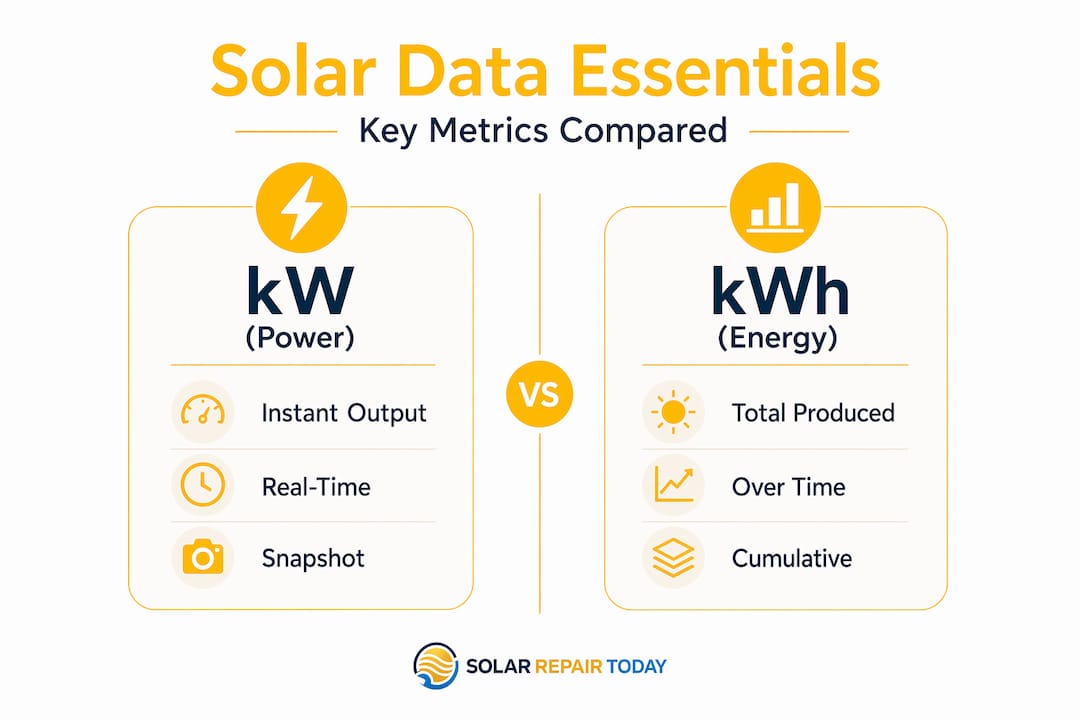
Understanding what each number means is the core skill. Two terms cause the most confusion: kW and kWh. kW is instantaneous power — how much electricity your system is producing right now, at this moment. kWh is accumulated energy over time. Your electricity bill, your solar credits, and your savings are all calculated in kWh, not kW.
A practical way to keep them straight: kW is like your car's speedometer. kWh is the odometer. One shows your current rate; the other shows total distance covered.
Here is a step-by-step process for reading your daily monitoring data:
- Check real-time output (kW). Open your app mid-morning on a clear day. A 6 kW system should be producing somewhere between 3 and 5 kW during peak hours. Near zero on a sunny day is a red flag.
- Review the daily production graph. Look for the bell curve shape. Production rises after sunrise, peaks around solar noon, and drops toward evening. A smooth bell curve means your system is working well.
- Note daily kWh total. By end of day, your app shows total energy generated. Compare this to your system's expected daily output based on season.
- Check self-consumption vs. export figures. If your app shows these metrics, self-consumption is the portion of solar energy your home used directly. Export is what went back to the grid.
- Look at monthly and annual totals. These figures let you compare against your installer's projections.
Consumption monitoring is one of the most overlooked pieces. Basic inverter monitoring only tells you what your panels produce. Without consumption data, you cannot see how much of that power your home actually uses, how much you export, or when your usage peaks. That information directly affects whether your system is financially optimized. Many monitoring platforms include consumption tracking if you have a consumption meter installed. Worth checking with your installer if you do not see those metrics.
Pro Tip: A good performance benchmark for a residential system on a clear day is approximately 75 to 85 percent of its rated capacity at solar noon. If you consistently see below 60 percent on clear days, that warrants a closer look.
The table below shows typical daily output ranges based on system size and season:
| System size | Summer daily output | Winter daily output |
|---|---|---|
| 4 kW | 16–20 kWh | 8–12 kWh |
| 6 kW | 24–30 kWh | 12–18 kWh |
| 8 kW | 32–40 kWh | 16–24 kWh |
| 10 kW | 40–50 kWh | 20–30 kWh |
Note: Ranges vary by location and climate. Use these as general benchmarks, not guarantees.
Warning signs and troubleshooting your monitoring data
Not every dip in your production graph is a problem. Clouds pass, birds land on panels, and trees cast shadows at certain times of day. Distinguishing normal variation from a real fault is where inverter data becomes your primary tool.
Key warning signs that require attention:
- Zero output on a sunny day. This is the clearest fault signal. Not low output. Zero.
- Sudden unexplained drops. If production falls by 20 to 30 percent and stays low across multiple sunny days, something is wrong.
- Repeated error codes. Single error codes can be minor events. Codes that recur daily indicate a persistent issue.
- One string or microinverter consistently underperforming. String inverter systems and microinverter setups display panel-level or string-level data. One consistently low performer points to a shading issue, faulty module, or equipment problem.
- Production that drops off early in the afternoon. On a clear day, this pattern often signals shading from a tree that has grown since installation.
"The shape of your production curve is a diagnostic tool, not just a visual. An asymmetric curve that drops off steeply on one side of noon is telling you something specific about your system environment."
When you see a warning sign, start with these basic steps before calling a technician. Check your inverter error codes against your inverter manufacturer's documentation. Many codes are minor and self-clearing. Verify that your inverter's Wi-Fi connection is active. Check the physical inverter display for status lights. If the inverter has tripped offline, a restart after resetting your inverter may restore normal operation. If the problem persists after a restart, contact your installer or a qualified technician.
Pro Tip: Enable push notifications in your monitoring app. Most platforms allow alerts for zero-output events or production dropping below a threshold. Early alerts catch problems in hours, not weeks.
Analyzing solar production trends over time
Daily monitoring tells you what is happening now. Trend analysis tells you whether your system is performing as promised over months and years. This is where you protect your investment long term.

Start with a monthly comparison. Most monitoring apps display month-over-month and year-over-year charts. Compare your actual production to what your installer projected for each month. A consistent 10 percent shortfall from projections across multiple months is meaningful. A single month underperforming due to unusual cloud cover is not.
Key areas to track in trend analysis:
- Performance ratio over time. Performance ratio compares actual output to the theoretical maximum given the solar resource at your location. A declining ratio across years can indicate panel degradation, soiling, or shading from new obstructions.
- Seasonal consistency. Your winter output will always be lower than summer. What matters is whether this winter compares reasonably with last winter for the same period.
- String or panel divergence. If one string or panel starts falling behind its historical output relative to others, that is early evidence of localized degradation or a developing hardware fault.
- Export volume changes. If your export to the grid is shrinking but your production is stable, your household consumption has increased. That affects your net metering calculations and possibly your system sizing adequacy.
Batteries add a layer of complexity to trend monitoring. When a battery is part of your system, production data may show lower grid export because the battery is absorbing that energy first. Net generation figures may look different from a battery-free system even when panel output is identical. Your monitoring platform should separate battery charge and discharge data from raw panel production. Check that these metrics are displayed distinctly, or you risk misreading your system's actual output.
The granular diagnostics enabled by detailed interval data can improve system performance by double-digit percentages. That is not a small gain for a system you are likely financing over 20 to 25 years.
My perspective on solar monitoring as a daily habit
I have reviewed hundreds of solar proposals and post-installation performance reports. The pattern is consistent. Homeowners who engage with their monitoring data in the first six months catch problems early. Homeowners who ignore it for a year often discover they have been underperforming quietly for most of that time.
The misconception I see most often is that solar is fully passive after installation. Set it and forget it. That is not accurate. Maximizing existing system performance is where the real financial gains are found, not in adding more panels. A 15 percent underperformance on a 6 kW system across 20 years represents thousands of dollars in lost generation.
I have also seen homeowners dismiss warning signs because they did not want to deal with the installer again. That reluctance is understandable, but a fault detected in month two is far cheaper to address than one discovered in year three after the initial warranty period has passed.
My honest recommendation: spend five minutes with your monitoring app once a week. Check the bell curve. Check your daily kWh total against the season. Look for error codes. That is it. Five minutes a week is what separates proactive system management from passive loss.
— David
Get a professional review before problems compound
If your monitoring data is raising questions you cannot answer, or if you have not yet signed a solar contract and want to understand what performance guarantees you are actually getting, Solarrepairtoday can help.
Through the Before You Sign program, Solarrepairtoday provides independent reviews of solar proposals, system sizing, financing structures, and equipment specs before you commit. If your installer's projected output does not match what your monitoring data is showing post-installation, a solar proposal review can clarify whether the original projections were realistic. For homeowners adding storage, the battery proposal review evaluates whether the battery sizing and integration make financial sense given your actual production profile.
Solarrepairtoday also offers a financing contract review to flag terms that may affect your long-term returns. The intake process is straightforward. Submit your documents, and an expert reviews them independently.
FAQ
What is the difference between kW and kWh in solar monitoring?
kW measures instantaneous power output at a given moment, while kWh measures total energy produced over time. Your savings and utility credits are calculated in kWh.
Why does my solar production look like a bell curve?
A bell curve shape reflects the sun's arc across the sky. Production rises after sunrise, peaks near solar noon, and tapers into evening. A smooth bell curve shape indicates normal system operation; irregular dips within that curve typically point to shading or cloud cover rather than a hardware fault.
How often should I check my solar monitoring data?
A weekly review covers most situations. Check daily kWh totals, scan for error codes, and verify the production curve shape. Set up push notifications for zero-output events so you catch serious faults immediately.
What should I do if my solar production shows zero on a sunny day?
Check your inverter display for error codes, verify the Wi-Fi connection to your monitoring platform, and attempt an inverter restart. If zero output persists after a restart, contact your installer or a qualified solar technician to diagnose the fault.
How do I know if my solar system is degrading?
Compare your current monthly output to the same month in prior years using your monitoring app's historical charts. A gradual year-over-year decline of more than 1 to 2 percent annually, especially when combined with a declining performance ratio, indicates possible panel degradation or shading from new obstructions.